Category: Startup Lessons

Hard-earned insights from building, testing, traveling, and iterating as a founder. Covers mindset, decision-making, failures, pivots, and personal observations from life inside startups and digital nomad work.

  • The Experiment Brief Template That Prevents Months of Thrash

    The Experiment Brief Template That Prevents Months of Thrash

    If you’ve ever run “a quick test” without an experiment brief template that somehow turned into six weeks of meetings, rework, and second-guessing, you’re not alone. I’ve watched innovation teams burn entire quarters on experimentation that never had a fair shot of answering the question they thought they were asking.

    The fix isn’t more ideas. It’s a better pre-commitment.

    A solid experiment brief template, an essential tool for applying the scientific method to business growth, forces the hard choices up front: what success means, what you’ll ignore, how long you’ll run it, and what decision you’ll make when the data comes back messy (because it will).

    If you’re responsible for revenue, this is about decision making under uncertainty, not paperwork.

    Why vague experiments create expensive thrash

    Clean, minimal black-and-white vector illustration of a product manager at a desk reviewing a one-page experiment brief document next to a laptop with analytics charts, in a simple office setting with a coffee mug.
    An operator reviewing an experiment brief next to analytics, created with AI.

    Most “thrash” isn’t caused by bad ideas. It comes from undefined constraints. When the brief is fuzzy, every new datapoint re-opens old debates.

    Here’s what that looks like in the real world:

    • You say the goal is metrics like conversion, then someone optimizes click-through rate because it moved faster.
    • You launch an A/B testing variant, then discover tracking breaks on mobile.
    • You call the result “inconclusive,” then run it longer, then peek daily, then ship anyway.

    Those aren’t execution problems. They’re experiment doc issues.

    There’s also a behavioral science angle here. Humans hate ambiguity, so we fill gaps with stories and unstated key assumptions. A PM sees a lift on day three and feels momentum. A founder hears “not significant” and assumes the team learned nothing. Sunk cost creeps in, then the team keeps running the test because stopping feels like failure.

    The money leak is usually invisible. Say you run a pricing page test to analyze user behavior:

    • 2 engineers for 1.5 weeks (call it $12k loaded cost)
    • 1 designer for 3 days ($2k)
    • 1 analyst for 2 days ($1.5k)
    • Opportunity cost: you didn’t ship onboarding fixes that might have improved activation

    Now ask the blunt question: what’s the plausible upside?

    If the page gets 40,000 visits per month, baseline signup is 2.5%, and paid conversion from signup is 10%, then 40,000 × 2.5% × 10% = 100 new paid users/month. A 5% relative lift on signup yields 5 extra paid users/month. If gross margin per new user is $400, that’s $2,000/month. Not bad, but you don’t get to spend eight weeks and $15k to find that out.

    I like templates that make these tradeoffs obvious. If you want examples of how teams document tests, Croct’s guide on planning and documenting A/B tests is a useful reference point, even if you don’t copy their format.

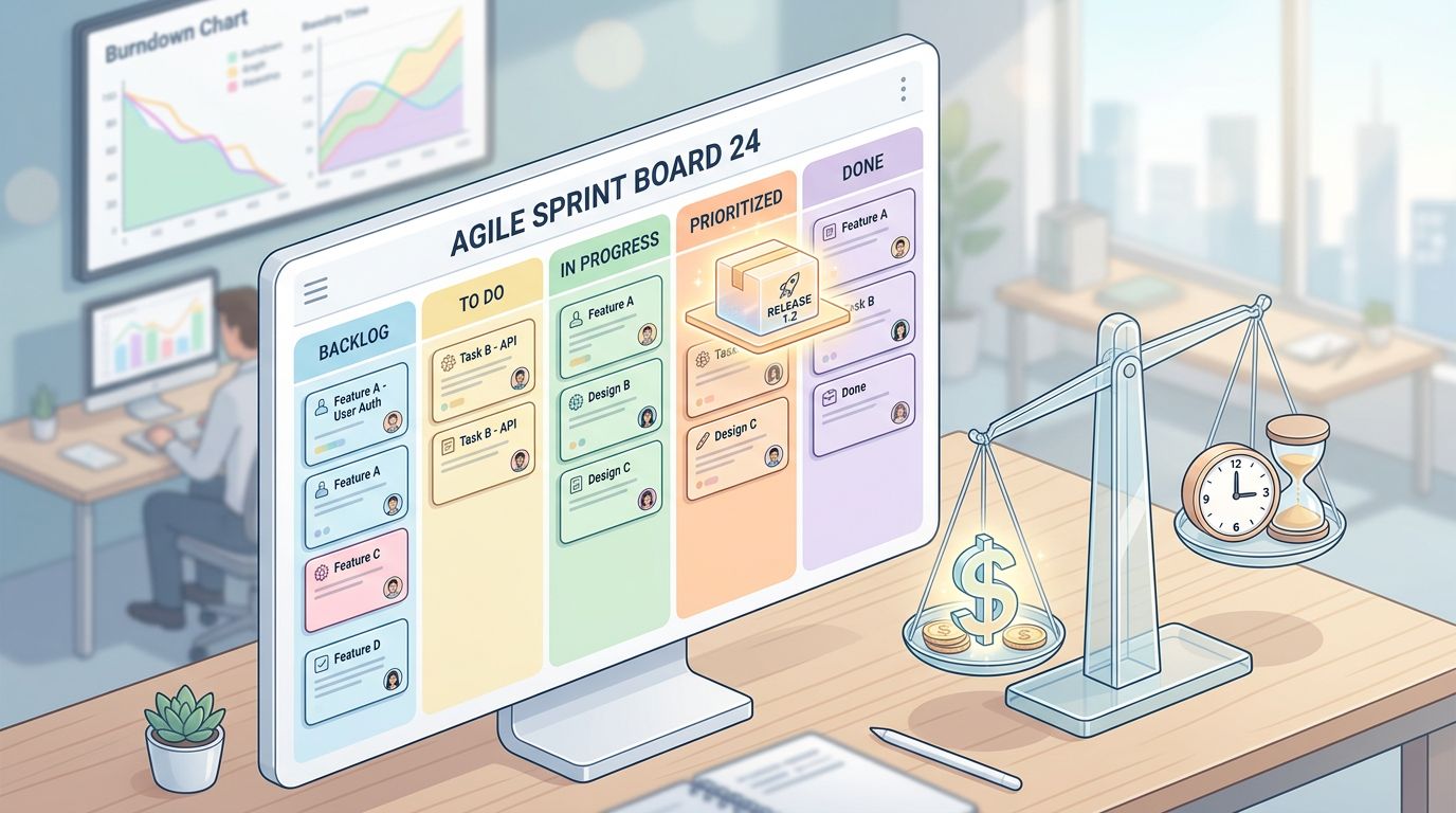
    The experiment brief template I use when revenue is on the line

    A clean, minimal black-and-white vector-style one-page worksheet titled 'Experiment Brief' with a simple table layout including sections for problem, hypothesis, target user, success metrics, experiment design, risks, dependencies, launch checklist, and decision rules, plus a callout box on common thrash causes.
    The one-page experimental design template I like to use, created with AI.

    I keep the brief to one page because it has to fit into a real operating cadence. If it takes an hour to fill out, it won’t happen. If it takes five minutes, it won’t be thoughtful.

    Before I approve a test, I want eight things answered. This is the core of my experiment brief template, which serves as both an experimental design template and lab report template:

    SectionThe question it forcesWhat it prevents
    Problem (1 sentence)What is broken, for whom, and where?Testing “because we should test”
    Testable hypothesis (If, then, because)What causal story are you betting on?Post-hoc narratives after results
    Target user + contextWhich segment and moment matters?Averaging away real effects
    Success criteria + guardrail metricsWhat wins, what must not break?Local wins that hurt revenue
    Baseline + expected liftWhat’s true today, what’s the bar?Tests that can’t pay back
    Experiment design (control group vs variants)What changes, what stays fixed?Moving goalposts mid-test
    Stop ruleWhen do we stop, even if it’s boring?Endless reruns and peeking
    Decision rule + owner + dateWhat will we do with the outcome?“Interesting” results, no action

    Two details matter more than teams expect.

    First, baseline plus expected lift. If you can’t write down current numbers and a realistic lift range for your testable hypothesis, you’re not ready. “Realistic” means you can defend it with past tests, funnel math, or customer behavior. This is where analytics discipline starts.

    Second, the stop rule. I don’t accept “run it for two weeks” unless traffic is stable and seasonality is trivial. I prefer a sample size based stop, plus guardrails. Factor in the minimum detectable effect for reliable results. If you need a quick way to sanity-check feasibility, I use GrowthLayer’s runtime calculator to decide if the test can finish in time or if we should choose a different lever.

    If you can’t state your stop rule before launch, you don’t have an experiment. You have a live debate with charts.

    Yes, I’ll sometimes use applied AI to draft the hypothesis wording or list risks. Still, the brief is a forcing function for humans, not a writing exercise for a model.

    If you want an alternate format for hypothesis phrasing, Miro’s A/B test hypothesis template is a decent starting point. I still keep my decision rule tighter than most templates do.

    Design the brief around a decision, not a report

    Minimal black-and-white vector art of a growth chart splitting into a steady control path and a wavy variant path with potential spike, surrounded by risk icons for time, cost, and uncertainty on a simple desk background.
    Control versus variant outcomes with risk and uncertainty, created with AI.

    A good brief fosters stakeholder alignment by ending with a decision you can actually make, providing validation for product growth initiatives. That sounds obvious, but it’s where most teams fall down.

    I pre-commit to one of three outcomes:

    • Ship if the primary metric clears the bar with statistical significance, data analysis confirms, and guardrails hold.
    • Iterate if the direction is promising but a failure mode likely suppressed impact.
    • Kill if the lift is below the bar or the risk shows up in guardrails.

    To make this concrete, I anchor the “bar” to dollars using quantitative indicators. Here’s the simplest version:

    Incremental monthly gross profit = monthly users exposed × baseline conversion × lift × gross profit per conversion.

    Example: 120,000 visitors/month, baseline conversion 3.0%, expected lift 6% relative (to 3.18%), gross profit per conversion $120.

    That’s 120,000 × 3.0% = 3,600 conversions baseline. Lift adds 216 conversions. 216 × $120 = $25,920/month.

    Now I can justify the cost. If the test costs $18k in team time and tool overhead, payback is under a month. If the math says $2k/month upside, I either tighten scope (cheaper) or pick a bigger lever.

    This is where conversion rate optimization meets product growth strategy. CRO isn’t “make the button green.” It’s choosing which constraints to attack for profitable startup growth and sustained product growth. For product-led growth teams, the same logic applies earlier in the funnel: activation, habitual use, expansion, incorporating both quantitative indicators and qualitative data. The metric changes, but the economics don’t.

    Three times this approach fails, and you should know that up front:

    • If the metric is too lagging (for example, annual contract revenue), your experiment window won’t match your cash needs.
    • If you can’t isolate the randomization unit (bad instrumentation, shared sales cycles), A/B testing may give false confidence.
    • If the main risk is strategic (positioning, category choice, key assumptions about product-market fit), a short test won’t settle it.

    Once the test finishes, I want the result stored where future me can find it. Otherwise you repeat work and call it learning. That’s why I like tools that act as a memory, not just a dashboard. When teams ask me how to avoid rerunning the same ideas, I point them to GrowthLayer’s organization and search so past experiments actually influence new ones. When it’s time to show the CFO what you got for the spend, shareable experiment reports keep the narrative grounded in evidence.

    A short actionable takeaway

    Write your next minimal experiment brief in 10 minutes, then ask one question about the learning objectives: “If this is inconclusive, do we still learn something worth the cost?” If the answer is no, change the design or don’t run it.

    That’s the point of an experiment brief template, an experimental design template that serves as your experiment checklist. It turns experimentation into a repeatable decision system, so you spend less time arguing about charts and more time improving the business.

  • An Experiment Brief Template That Stops Stakeholder Rewrites

    An Experiment Brief Template That Stops Stakeholder Rewrites

    If stakeholders keep rewriting your experiment doc, it’s not because they’re picky. It’s because your brief doesn’t answer the questions they get judged on.

    A good experiment brief template isn’t paperwork. It’s a one-page contract for decision making under uncertainty based on principles of the scientific method, where everyone agrees on success criteria, the agreed-upon metrics for the test, before you burn a sprint.

    I’ll show the exact template I use, why it works, when it fails, and how to tie it to real financial impact so your A/B testing program stops stalling in meetings.

    Why stakeholders rewrite experiment briefs (and why it’s expensive)

    Stakeholder rewrites, a sign of poor stakeholder alignment, usually come from one of three fears:

    First, they don’t trust the metric. You write “increase conversion,” they hear “you might tank revenue.” If you don’t include guardrails, a CFO assumes you’re optimizing for vanity.

    Second, they don’t trust the causal story. A hypothesis like “make the CTA bigger” is a tactic, not a bet. Executives want the hypothesis with the “because.” They’re asking, “What user behavior, and why?” That’s behavioral science, even if nobody calls it that in the room.

    Third, they don’t trust the operational plan. If runtime, sample size, key assumptions, and risks aren’t clear, they assume you’re guessing. In a startup growth context, “guessing” means opportunity cost. Two weeks on an underpowered test can be the difference between hitting payroll and missing it.

    This is why the brief gets rewritten. Each rewrite is the stakeholder trying to protect their downside.

    A simple way to see it: an experiment is like a small loan from the company to your team. The brief is the credit memo. If your memo is vague, the lender adds terms.

    If you want a decent external reference for what a structured plan looks like, this experimental design template lays out the basics. I’m going to push it further toward decisions and dollars, because that’s what stops rewrites.

    Here’s the bar I set: if I can’t get approval in 10 minutes with the one-pager, the experiment isn’t ready.

    The one-page experiment brief template I actually use

    Clean, minimalist black-and-white one-page document mockup of an experiment brief template with sections for problem, hypothesis, metrics, audience, variants, and more. Landscape format, high-contrast, professional layout suitable for blog embedding.
    An AI-created one-page experiment brief template layout with the exact sections I use to prevent last-minute rewrites.

    This experiment brief template works because it forces the two things stakeholders care about: tradeoffs and commitments.

    Before the template, one practical rule: keep it to one page. If it needs two pages, you don’t understand the bet yet.

    Here are the heavy-lifting sections, the core of your experiment design:

    Problem / Opportunity
    Write the business symptom, not the solution. Example: “Paid signups flat, trial-to-paid down 8% in 6 weeks.”

    testable hypothesis
    This is where behavioral economics shows up. Write your hypothesis in the “If… then… because…” structure. Example: “If we reduce perceived risk at checkout, then paid conversion rises, because loss aversion is strongest at the payment step.” This hypothesis format grounds your experiment design in behavioral economics principles.

    Primary Metrics + Guardrails
    Primary metrics answer “what’s the win?” Guardrails, essential quantitative indicators, answer “what could break?” For conversion work, I almost always include revenue per visitor, refund rate, and lead quality (if relevant). If you want a clear definition of conversion rate basics to align non-growth folks, Amplitude’s write-up on experiment briefs is a decent shared language starter.

    Audience / Targeting
    Spell out who sees it and who doesn’t, including the randomization unit. Many “wins” are just mix shifts.

    Variant(s) / What changes and What stays the same (constraints)
    This prevents the classic rewrite where Design adds “one more improvement” and you end up testing five things at once. Specify that the control group must remain constant.

    Run time + sample size estimate
    This is where most teams lose credibility. I don’t start a test without a duration range and a minimum detectable effect (MDE) reality check. If you need a quick tool to sanity-check it, I use an A/B test sample size calculator before anything hits engineering.

    Risks / Dependencies
    List the one or two that matter. “Pricing page rewrite scheduled mid-test” matters. “Might be hard” doesn’t.

    Decision rule (win/lose/inconclusive)
    This is the rewrite-killer. Stakeholders rewrite because they want a say in what happens after the result.

    To make it concrete, I use a high-speed lab report template like this small table inside the brief:

    OutcomeThreshold (example)What we doFinancial framing
    Win+3% or more on paid conversion, guardrails OKShip, then iterate“At 120k visits/month, +3% is +360 signups; at $80 gross margin each, that’s ~$28.8k/month”
    Lose0% or worse, or guardrail breachRoll back, document why“We paid for learning, not denial”
    InconclusiveBetween 0% and +3%, or underpoweredRun follow-up only if upside is worth more time“Don’t spend another 2 weeks for a maybe-$5k/month lift”

    The takeaway: the template isn’t “more documentation.” It’s pre-negotiation.

    If you don’t write the decision rule before the data, you’ll write it after the politics.

    How I run this brief so it becomes a decision, not a document

    A focused product leader sits at a simple desk in a minimalist modern office, reviewing a one-page experiment brief on paper with natural window light. Close-up side angle emphasizes the document texture and professional concentration.
    An AI-created scene of a product leader reviewing a one-page brief, the moment where clarity prevents churn.

    The template alone won’t save you if you run the process wrong. Here’s what I do in practice.

    I force “money math” into the room

    For a product growth test, I always include a back-of-the-envelope impact line. Not a model, just the order of magnitude.

    Example: you’re testing a checkout reassurance module (refund policy, security, delivery clarity). Baseline paid conversion is 2.0% on 200,000 monthly sessions. A +0.2 percentage point lift sounds small, but it’s +400 purchases. If margin is $50, that’s $20,000/month. Now the team can compare that to engineering cost, risk, and runway.

    This is where data analysis earns its keep. If attribution is messy, say it. Then make the assumption explicit. Stakeholders rewrite when they feel you’re hiding uncertainty.

    I set a hard approval moment

    I don’t accept “LGTM, but…” in Slack. Approvals happen with names and dates in the brief, marking the final validation step for innovation teams.

    If you want to scale this across innovation teams, I’ve found it helps to make results easy to share after the fact. A clean archive reduces repeat debates. That’s why I like having experimental design template that stakeholders can view without me translating the whole thing in a meeting.

    I use AI for consistency, not authority

    Applied AI helps in two places:

    • Pre-flight checks: The system checks the hypothesis and metrics for consistency: “Did we define guardrails? Did we set a decision rule? Did we run the runtime calculator? Are variants testable?”
    • Iteration suggestions: after a win, I want the next logical test, not a new brainstorm. A system that surfaces learning objectives from history can keep product-led growth teams compounding improvements instead of thrashing.

    AI doesn’t get to decide. It helps me avoid dumb omissions that trigger stakeholder rewrites.

    When this template fails (and who should ignore it)

    It fails when the company can’t commit to a decision. If leadership wants optionality more than truth, the brief becomes theater.

    Also, don’t use this format for exploratory research. Exploratory research often relies more on qualitative data than this format allows. If you’re still figuring out what problem matters, run discovery. This template is for experiments where a shipped change is on the table.

    For teams doing positioning tests (message-market fit, landing page promise, pricing framing), you can borrow ideas from a brand sprint approach, like this startup brand strategy playbook, but still keep the same decision rule discipline.

    The brief isn’t there to make everyone happy. It’s there to make the next action obvious.

    A short actionable takeaway (use this tomorrow)

    Copy the one-page minimal experiment brief, then add one essential experiment checklist item: no build starts until the decision rule, including statistical significance, is written and approved. If someone wants to rewrite later, point back to the signed decision rule and ask what assumption changed.

    That’s how you protect experimentation velocity without gambling with conversion, revenue, or trust. This process also safeguards the path to product-market fit.

    If you try it, the most telling signal is simple: do rewrites move earlier in the process, or do they disappear? Either outcome is progress, because you’re no longer paying for surprise debates after the test ships. This approach is the hallmark of professional experiment design.

  • How To Choose the Smallest Effect Worth Shipping (Without Burning a Sprint)

    How To Choose the Smallest Effect Worth Shipping (Without Burning a Sprint)

    Most teams don’t fail because they ship nothing. They fail because they ship a lot of work that never moves the numbers, incurring shipping costs from unsuccessful features.

    When I’m under pressure, the trap is simple: I treat “a good idea” as “a shippable idea,” blind to the complexities akin to international shipping. Then two weeks pass, the result is muddy, and I’m arguing over anecdotes.

    The fix is choosing an effect worth shipping before I write the first ticket. Not a perfect forecast, just a clear threshold tied to money, time-to-learn, and risk. This is how I keep experimentation honest and keep a growth roadmap from turning into a wish list.

    Start with the money, then constrain the measurement window

    If I can’t translate a change into its declared value (or a leading indicator that reliably predicts dollars), I’m not doing decision making, I’m doing storytelling.

    I start with one target metric and one baseline. For most startup growth teams, that’s a funnel conversion point: visit to signup, signup to activation, activation to paid. I avoid “engagement” unless I can prove it leads revenue.

    Next, I force a time constraint: can I measure this in 2 weeks or less? If the answer is no, I’m either shipping smaller under the de minimis exemption, or I’m running a different kind of test (more on that later). Time is the import tax of data tracking, not a detail.

    Here’s the quick math I use to keep myself honest, like preparing a commercial invoice for the business case. I don’t need precision, I need a sane order of magnitude.

    InputExampleWhy it matters
    Monthly visitors to the step200,000Sets the ceiling on learnings per month
    Fair market value3.0%Defines your starting point
    Value per conversion (gross profit)$40Keeps you from optimizing vanity
    Candidate lift+0.2% absolute (3.0% to 3.2%)Converts “small” into “real”
    Monthly declared value200,000 × 0.2% × $40 = $16,000The number you can argue about

    If a change has a plausible path to a declared value of $16,000 per month and I can learn in 2 weeks, I pay attention. If it’s $1,600 per month, it qualifies for the de minimis exemption, and the bar goes way up, unless it’s also a risk reducer (fraud, churn, support load).

    Also, I sanity check whether the lift is even detectable with my traffic. If you don’t do this, you’ll run underpowered A/B testing and call it “inconclusive,” which is just expensive ambiguity. I keep a sample size tool nearby, for example an A/B test sample size calculator, and I use it before I commit engineering time.

    If I can’t explain the expected declared value in one sentence, I’m not ready to ship or test.

    Define “smallest effect worth shipping” as a threshold, not a hope

    The smallest effect worth shipping (SEWS) is not “the smallest lift I’d be happy about.” It’s the smallest lift that beats the full cost of shipping, including hidden costs like customs duty that I used to ignore.

    I set SEWS with four inputs, much like the harmonized tariff system (HTSUS) provides a standardized framework for scoring feature effort:

    First, cost. Engineering time is obvious, but I also price in QA, analytics instrumentation, design review, and the meeting tax, all as a kind of customs duty. If I think it’s a one-day change, I still ask, “What’s the chance this becomes three days because of edge cases?”

    Second, risk. Some changes can quietly hurt conversion, even if they look like “cleanup.” Behavioral science helps here. Users are loss averse, so removing familiar elements can backfire. Behavioral economics also shows friction matters more than you think. A “small” extra step can have a big drop-off, representing carrier liability for loss or damage.

    Third, confidence. I don’t pretend to have a single lift estimate. I write three numbers: best case, expected, worst case. Then I ask, “What’s the probability I’m wrong in a painful way?”

    Fourth, time-to-learn. If the measurement needs a long payback window, I treat the SEWS threshold as higher. Slow feedback is expensive because it blocks other bets.

    Here’s the decision rule I use most weeks:

    • If the expected impact clears SEWS and the worst case won’t sink me (factoring in replacement cost for rollbacks), I ship (often behind a flag as shipping insurance).
    • If the expected impact clears SEWS but worst case is ugly, I only proceed with a contained experiment backed by shipping insurance.
    • If only the best case clears SEWS, I don’t ship. I shrink the idea until it becomes testable.
    Clean, minimalist black-and-white decision flowchart diagram for evaluating if a feature's effect is worth shipping. Features steps like defining metrics, estimating effects, scoring effort, and a side panel table for effect size, confidence, cost, and time to learn.
    Decision flowchart for picking the smallest effect worth shipping, created with AI.

    One warning: SEWS fails when teams use it as a weapon to kill anything uncertain. Growth is uncertain by nature. The goal is faster learning with fewer expensive mistakes, not a fake sense of safety.

    Choose experiments that teach fast, even when the “real” win is long term

    A/B testing is great when you have stable traffic, clean instrumentation, and a clear conversion event. Still, I don’t start by asking, “Can we A/B test it?” I start with, “What’s the cheapest experiment that can prove or disprove the mechanism?”

    Mechanism matters because it tells me why something should work. In global e-commerce, mechanisms tend to fall into a few buckets: reduce effort, reduce doubt, increase clarity, increase motivation, or reduce perceived risk. If I can’t name the mechanism, I’m guessing.

    Then I pick the smallest test that validates the mechanism, like an initial customs clearance for the idea:

    • If the mechanism is “users don’t notice the value,” I can test messaging, information order, or defaults.
    • If it’s “users don’t trust us,” I can test social proof placement, guarantees, or pricing transparency.
    • If it’s “users can’t complete the step,” I can test error handling, field reduction, or a guided flow.

    This is where analytics discipline matters. I define one primary metric, one guardrail (like refunds, churn, or support tickets for dutiable articles), and one segmentation cut I care about (personal effects such as new vs returning, household effects like mobile vs desktop). I also check for obvious issues like sample ratio mismatch, because broken assignment can create fake winners.

    Clean black-and-white line drawing of one founder seated at a simple home office desk, examining subtle graphs on a notebook showing baseline and small lift in conversion rate, with relaxed hands, coffee cup nearby, natural daylight, focused calm expression, ample negative space.
    Founder reviewing baseline vs lift before committing to a release, created with AI.

    Finally, I protect iteration speed with retail shipments of small updates. A win that doesn’t get followed up is wasted. If you want compounding results, set a rule that every “win” must produce a next test within 48 hours, complete with proof of purchase from the experiment and final customs clearance before shipping at scale. When I need help keeping follow-ups tight, I like having next test suggestions tied to past results, because memory fades fast under deadline.

    Where applied AI helps, and where it can lie to you

    Applied AI is useful when it cuts cycle time without inventing truth, much like a duty-free shop of low-cost options.

    I’ll use AI to draft variant copy, generate alternative layouts, cluster qualitative feedback, or scan experiment notes for repeated patterns. It’s also good at spotting oddities in event streams, which helps when instrumentation breaks. These are low-value trade tasks that thrive on high volume and low stakes.

    Still, I don’t let AI set my SEWS threshold. That’s a business choice tied to cash, runway, and opportunity cost. AI also doesn’t feel the cost of a false positive. If it convinces you to ship a “winner” that’s noise, your product-led growth motion can drift for months. My personal allowance is the strict limit for trusting AI without human oversight.

    So I keep the boundary clear: AI can propose options at a flat duty rate of predictable effort, but measurement decides amid the tariff rates of growth workflows. If the change can’t be measured cleanly, I treat it as a product decision, not a growth bet.

    Conclusion: the decision I make before I build anything

    When I choose the smallest effect worth shipping, I’m buying clarity and avoiding unaccompanied purchases, features shipped without a follow-up plan. I treat personal exemptions as small, low-risk changes that can skip heavy SEWS analysis, while targeting duty-free clean, high-impact wins. I tie the bet to money, I size it to my measurement window, and I pick an experiment that can teach fast. That keeps my growth strategy grounded, even when data is messy.

    Actionable takeaway: write your effect worth shipping on the ticket before work starts: baseline, minimum lift, time-to-learn, and worst-case downside. If you can’t fill those in, shrink the scope until you can.

  • Building a Metric Tree That Holds Up Under Stakeholder Pressure

    Building a Metric Tree That Holds Up Under Stakeholder Pressure

    Stakeholder pressure in business strategy doesn’t break your metric tree because people are unreasonable. It breaks because the tree isn’t tied to a decision anyone is willing to defend.

    I’ve been in the room when revenue misses, the board wants answers, and every exec grabs the nearest metric to justify their plan. In that moment, “more KPI dashboards” never helps. A metric tree helps only if it ensures strategic alignment and stays stable when the conversation turns political.

    Here’s how I build one that survives, supports experimentation, and keeps decision making anchored to money.

    Start with the decision you’ll be blamed for

    Clean, minimalist black-and-white line art illustration of one founder seated at a sparse office desk with an open laptop showing abstract charts, hands relaxed on keyboard, thoughtful expression, single coffee mug, and background window with city view.

    An operator under pressure sorting signal from noise, created with AI.

    Most teams start a metric tree by arguing about a north star metric. I start by asking a sharper question: what decision is this tree supposed to make easier next week?

    Examples that matter:

    • “Do we ship self-serve onboarding v2 or fix trial-to-paid conversion first?”
    • “Do we scale paid spend, or will it flood support and kill retention?”
    • “Can product-led growth carry Q2, or do we need sales assist?”

    If you can’t name the decision, the tree becomes a negotiation tool. That’s when stakeholder pressure wins.

    Here’s the constraint I use, similar to an issue tree in consulting: every node in the tree must form a logical hierarchy that connects to business outcomes and an action that changes behavior. That’s straight behavioral science. People fight for metrics because metrics justify status and control. If your tree doesn’t force tradeoffs, it will be rewritten by the loudest person.

    I like the framing in Mixpanel’s explanation of what a metric tree is and how it works, as it maps the growth model, but the survival part is operational, not conceptual.

    When this approach fails: if your business model is changing monthly (new ICP, new pricing, new channel), don’t pretend the tree is permanent. In that phase, keep a smaller tree and accept churn. Stability is earned.

    Who should ignore this: teams without a real owner for revenue outcomes. If nobody feels the pain of a miss, you’ll end up optimizing activity.

    If a metric doesn’t change a decision, it’s trivia. Treat it that way.

    Anchor the metric tree to dollars, then limit it to 3 levels

    Stakeholder pressure usually shows up as “Why aren’t we tracking X?” The best defense is a tree that’s obviously tied to financial impact.

    I anchor level 1 to a north star metric tied to dollars that I can reconcile to finance, driving revenue growth. In many startups, that’s weekly net new MRR, gross profit, or retained revenue. Pick one. If you choose “engagement” as the north star metric, you’ll spend the next year debating what engagement means.

    Then I build level 2 as the minimum set of input metrics, specifically the l1 input metrics, that explain movement in level 1. This decomposition breaks down the north star metric into its key drivers, where the input metrics combine according to a mathematical formula to equal the level 1 metric. For most subscription products, it’s some version of:

    • Acquisition (qualified traffic, qualified signups)
    • Activation (time-to-value, first key action)
    • Retention (logo retention, usage retention)
    • Monetization (trial-to-paid, expansion, pricing mix)

    Level 3 is where you put operational metrics that teams can actually move with A/B testing and product changes. This is where conversion work lives: landing page conversion, onboarding completion, paywall conversion, pricing page CTR, and so on.

    To keep the tree from becoming a monster, I set two hard rules:

    1. Three levels max. Anything deeper becomes a debate club.
    2. One owner per metric. Owners write definitions and defend data quality.

    A small table helps me explain the “why” and the failure mode to stakeholders:

    Metric (example)Why it mattersCommon way it gets abused
    Trial-to-paid conversionDirect revenue linkageDiscounting to “win” short-term revenue
    Activation ratePredicts retention in product-led growthInflating the definition to look good
    Refund rateProtects net revenueIgnoring it because top-line looks fine
    Support tickets per new customerGuardrail for startup growthHiding it by changing categories

    The point isn’t perfection. It’s that your tree makes tradeoffs explicit. If someone wants to push a metric into the tree, they must answer: does it change forecasted dollars, or is it a proxy for an input we already have?

    For more context on how teams use trees to align and prioritize, see LogRocket’s piece on using a metrics tree to align and track progress. I don’t copy their process, but the alignment problem is real.

    Pressure-test the tree with experiments, guardrails, and a decision rule

    A minimalist black-and-white diagram of a 3-level metric tree with Revenue as the North Star Metric, input metrics for Acquisition, Activation, Retention, and Monetization, operational examples, guardrails, decision rules, and ownership notes to survive stakeholder pressure.

    A simple three-level metric tree with guardrails and decision rules, created with AI.

    A metric tree survives stakeholder pressure when it includes the answer to the most annoying meeting question: “What if the input metric moved but revenue didn’t?” This setup enables root cause analysis right in the tree structure, where influence relationships and component relationships between input nodes and the parent node clarify why revenue might miss.

    That’s not an edge case. It’s the normal case, because analytics is noisy and markets move.

    So I bake in two things: guardrails and a decision rule.

    Guardrails are metrics you promise not to break while chasing the North Star. Typical ones: churn, refunds, latency, support tickets, fraud rate, and chargebacks. If someone proposes an experiment that risks a guardrail, it’s not “bad,” it’s just a different bet with a different expected value.

    Then I write a decision rule that makes A/B testing outcomes harder to spin. Mine usually looks like this:

    If a level 3 metric moves but the level 1 metric doesn’t, I first assume measurement error or confounders, not “the strategy failed.”

    That rule forces three checks before anyone changes strategy:

    1. Instrumentation sanity check: Did the event definition change in the data model or semantic layer? Did attribution break? Did traffic mix shift? (This is where many “wins” die.)
    2. Confounder check: Seasonality, price changes, channel mix, and sales behavior often explain the gap.
    3. Segment check: Sometimes the effect is real but isolated, for example new users improve while existing users don’t.

    Applied AI can help here, but only if you keep it practical. I’ll use anomaly detection to flag when a metric moves outside normal variance, or a simple model to estimate revenue impact from activation shifts. These trees typically live in a visualization tool. Still, I don’t let a model overrule common sense, drawing from mathematical rigor in metric spaces, the triangle inequality, and vantage point trees to prevent confident nonsense in shaky data pipelines. As Abhi Sivasailam emphasizes as a thought leader in this space, such structures ground decisions.

    When stakeholders push pet metrics, I redirect to the tree and ask for a falsifiable claim: “Which node moves, by how much, and what guardrail might break?” If they can’t answer, it doesn’t enter the tree.

    Mixpanel has a good overview of how trees help teams avoid common traps, including misalignment and noisy metrics, in how metric trees solve common product problems. The missing ingredient is the pressure test and the rule, because that’s what keeps the tree intact in a tense room.

    Conclusion: the tree’s job is to stop bad arguments early

    A metric tree that survives stakeholder pressure is simple, financial, and hard to game, unlike vanity metrics. It links conversion and retention work to real dollars driven by customer value, supports experimentation, and makes tradeoffs visible for strong operational execution.

    My short actionable takeaway: schedule a 45-minute “tree defense” session. Bring your North Star focus metric, 4 input metrics, 2 guardrails, and one decision rule. If you can’t defend each metric in one minute, cut it. You’ll end up with a robust data structure and feel the clarity immediately, and so will everyone who depends on your forecast.

  • The Expected Value Framework For Choosing What To Test Next

    The Expected Value Framework For Choosing What To Test Next

    When my experiment backlog gets long, my decision quality drops fast. Everything looks “important,” every stakeholder has a favorite, and the loudest idea starts to win.

    That’s when I fall back on the expected value framework. Not because it’s fancy, but because it forces one thing: dollars first, opinions second.

    If you’re a founder or product owner under pressure, you don’t need more ideas. You need a clean way to pick the next test that’s most likely to pay for itself, while keeping risk under control.

    Why expected value beats “high impact” scoring in real life

    A mid-30s male product leader sits thoughtfully at a modern wooden desk in a bright home office with natural daylight, laptop open to an analytics dashboard, notebook with ideas, and coffee mug nearby.
    An operator pressure-testing experiment options against real constraints, created with AI.

    Most A/B testing prioritization breaks because it hides the real tradeoff. We pretend we’re ranking “impact,” but we’re actually choosing how to spend scarce time under uncertainty.

    Expected value fixes that. It functions as a superior prioritization framework compared to the PIE model, ICE scoring model, or PXL framework by providing a calculation for return on investment in experimentation, treating it like any other investment decision:

    • There’s a possible upside (lift toward business goals).
    • There’s a chance it works (probability).
    • There’s a cost (time, engineering, coordination, opportunity cost).
    • There’s risk (brand damage, revenue volatility, support load, pricing confusion).

    This is plain decision making under uncertainty. It’s also aligned with behavioral science: humans overweight vivid stories and recent wins, and we anchor on “big ideas.” EV pushes you back toward base rates and math.

    It’s especially useful in startup growth because your constraints are tighter. You can’t run ten tests to find one winner. You often get one shot per sprint.

    One more reason I like EV: it keeps teams honest about what “impact” means. A 2% lift sounds small until you convert it into dollars per week. Meanwhile, a “big redesign” can look exciting and still have negative EV once you price in cost and risk.

    If you can’t explain why a test is worth running in dollars, you’re not prioritizing. You’re hoping.

    How I calculate expected value for A/B testing (in dollars)

    Clean, minimal high-contrast table diagram illustrating an Expected Value (EV) framework for prioritizing A/B tests like pricing, onboarding, and win-back emails, with columns for probability, lift, value, cost, risk, and net EV ranking.
    A simple EV scorecard for ranking tests by upside, cost, and risk, created with AI.

    Here’s the core model I use:

    EV = p × lift × value − cost − risk

    I keep it simple on purpose. This model excels in A/B testing and conversion rate optimization. If the model gets too detailed, nobody trusts it, and it stops being used.

    Step 1: Define “value” as a real unit for expected value calculation

    Pick the unit that connects to cash:

    • For checkout tests: value = gross profit per order.
    • For activation tests in product-led growth: value = expected gross profit per activated user (often activation-to-paid × LTV margin).
    • For win-back: value = expected margin per reactivated customer.

    If attribution is messy, I still choose a unit. Imperfect beats imaginary.

    Step 2: Estimate lift and probability like an operator, not a pundit

    I start with analytics and back-of-the-envelope math:

    • What metric will move (activation, purchase, retention)?
    • How many users hit that step weekly?
    • What’s the plausible lift range, given past tests?

    Then I set p, the probability of occurrence for the test delivering potential for improvement, not “any lift.” If your bar is +1% and you can’t detect that reliably, your p is lower than you think.

    Applied AI can help here, but only as an assistant in modern AI product management. I’ll use a model to summarize similar past experiments, cluster user feedback themes, or extract patterns from session notes. I won’t let it invent probabilities. The base rate has to come from your history.

    To make this concrete, here’s a lightweight example table I’d actually use in conversion rate optimization planning:

    Test ideap (works)Expected liftValue per unitGross EV (monthly)Cost (time)Risk notesNet EV
    Onboarding step removal0.35+6% activation$40 / activated$8,400$2,000Low brand risk$6,400
    Win-back email sequence0.25+4% reactivations$60 / reactivated$3,600$800Deliverability risk$2,800
    Pricing test0.15+10% revenue/user$25,000 / month baseline$3,750$1,500High trust risk$2,250

    The takeaway is not the exact numbers. The point is that EV turns fuzzy debates into comparable expected profit bets.

    Where the expected value framework fails (and how I guardrail it)

    EV can still push you into bad calls if you ignore time, error costs, and second-order effects.

    Trap 1: Chasing “lift” while ignoring error cost

    If you run lots of A/B testing, false positives and false negatives will happen. Some teams celebrate a winner, ship it after threshold optimization, and then wonder why revenue didn’t move.

    I like decision-theoretic thinking here, where you weigh benefits against the cost of being wrong. The research on ranking A/B tests by cost-benefit matches what I’ve seen in practice: you should care about profit, not just statistical significance.

    Guardrail: I utilize a cost-benefit matrix for risk mitigation by charging a “risk tax” on tests with high downside. Pricing, trust, and anything that touches billing gets one.

    Trap 2: Ignoring time-to-learn

    A high-EV test that takes six weeks might lose to a medium-EV test you can run this week. Speed matters because it enables sequential decision-making that compounds. The best growth strategy is often the one that increases learning velocity without burning credibility.

    Guardrail: I treat “cost” as fully loaded. Engineering time, QA, analytics instrumentation, and review cycles all count.

    Trap 3: Letting the model override strategy

    Sometimes you run a test because you need to learn something structural. For example, you may need to validate willingness to pay, even if short-term EV looks mediocre. That’s fine, just label it as a learning bet, not a revenue bet. I use a decision tree to map out learning versus revenue paths.

    If you want a practical view on building an experimentation program that doesn’t drown in process, I generally agree with the emphasis on cadence and alignment in this A/B testing strategy guide.

    Guardrail: I keep two lanes, “cash EV” and “strategic learning,” and I don’t mix them.

    Trap 4: Not writing down what you learned

    EV gets better only if your probabilities improve over time. That means documentation that’s easy to maintain, where you can apply sensitivity analysis to see how changes in variables affect past outcomes. Otherwise, every quarter starts from zero.

    I’ve borrowed a lot from lightweight learning logs like this experiment documentation approach, because it focuses on reusable insights, not pretty decks.

    My weekly decision rule (use this on your next sprint)

    I don’t overthink it. Each Monday, I do this, incorporating learning from past results akin to reinforcement learning, where past winners act as an eligibility trace for future bets:

    1. List 5 to 10 test candidates with a clear primary metric tied to conversion or retention.
    2. Put a dollar value on the unit, even if it’s rough.
    3. Assign p, expected lift, and model confidence scores from your base rates.
    4. Subtract full cost and add a risk tax when downside is asymmetric.
    5. Run the top Net EV test that fits your current constraints.

    Then I ask one last question: if this test fails, will I still be glad we ran it? If the answer is no, the EV math is missing something. This question helps distinguish between true positives and true negatives in your experimental history.

    In the end, the expected value framework is just a discipline. It keeps you from spending your scarcest resource, team attention, on the wrong bet.

  • How To Pick One North Star Metric For Experiments

    How To Pick One North Star Metric For Experiments

    If your team runs experimentation, you already know the ugly part: the results meeting turns into a debate about which metric “matters.” Someone points at conversion. Someone else points at retention. Finance wants revenue. Product wants engagement.

    When you don’t have a single North Star Metric, every A/B testing process becomes politics. You ship noisy wins, miss real wins, and waste cycles arguing.

    I’m going to show you how I pick one North Star Metric for an experimentation program to drive revenue growth. Not a poster metric. A primary metric for your growth model that improves decision making under uncertainty.

    What a north star metric must do (or your experiments won’t compound)

    Minimalist black-and-white vector infographic with blue accents showing a four-step flowchart for selecting a north star metric for experiments, featuring icons for revenue/retention, user value, speed of change, and resistance to gaming.

    Flowchart to identify North Star Metric that stays tied to cash outcomes, created with AI.

    A north star metric is not “the most important number in the company.” In an experimentation context, it’s the primary metric you agree to optimize when tradeoffs show up.

    Here’s what I require before I let a metric become the north star:

    First, it has to connect to lagging indicators like revenue growth or retention with a straight face. I don’t need perfect attribution, but I need a believable chain: metric up, cash up (now or later). If you can’t explain that chain in 60 seconds, the metric is a distraction.

    Second, it must represent a user value moment. This is where behavioral science earns its keep. People don’t buy because your funnel is pretty. They buy because they felt customer value, reduced effort, or avoided loss. Your north star should track the user behavior that happens right after value is delivered (not the behavior that happens when someone is merely curious).

    Third, it has to move fast enough as a leading indicator to be useful for experimentation. If your metric needs 90 days to show signal, your program will drift into vibes. For startup growth, speed matters because runway is short and learning needs to be tight.

    Fourth, it must be hard to game, and pair it with guardrail metrics. If a team can inflate the metric without improving the product, they will. Not because they’re bad people, but because incentives work. A metric that’s easy to game will turn your growth strategy into theater.

    If you want a solid baseline definition and examples, I generally align with Amplitude’s guide to finding a North Star Metric, then I tighten it for experiments.

    My rule: if the metric doesn’t change when the user gets more value, it’s not your north star.

    This is also where product-led growth either becomes real or becomes a slide, aligning with acquisition retention monetization frameworks. In PLG, the product is the sales motion. So the north star serves as the fundamental unit of value, sitting close to “user got value,” not “we got traffic.”

    How I pick the metric in practice: start at cash, then walk backward to behavior

    I start with the P&L, then I move backward to the product.

    Why? Because experiments are expensive. Even “simple” tests eat design, engineering, QA, analysis, and opportunity cost. If your north star doesn’t line up with how you make money and align with business goals, your experimentation roadmap will feel busy and still miss the quarter. The key is to find the right unit of value.

    Here’s the selection process I use:

    1. I write down the cash outcome I care about most in the next 6 to 12 months (new revenue, expansion, churn reduction).
    2. I name the user value moment that has a causal connection to that cash outcome.
    3. I list 3 to 5 candidate metrics that reflect that moment.
    4. I pick the one that best balances speed, integrity, and cash alignment.
    5. I keep the others as secondary metrics or guardrails, not co-equal goals.

    This quick table is how I pressure-test candidates before I commit:

    Candidate metricMoves in days/weeks?Tied to revenue/retention?Easy to game?Best when
    Signup conversionYesWeak aloneMediumYou’re fixing onboarding friction
    Activated users (defined)UsuallyStrongerLowerProduct-led growth motion
    Daily active usersYesDependsHighHigh-frequency consumer products
    Weekly active usersYesDependsHighYou have clear “active” definition
    Monthly active usersYesDependsHighEnterprise retention focus
    Conversion rateOftenVariesMediumFunnel optimization stages
    Trial-to-paid conversionOftenStrongMediumSales cycle is short
    Retained paying accountsNo (slow)Very strongLowYou can wait for signal

    A concrete example from B2B SaaS: I’ll often choose activated accounts per week as the north star for growth efficiency, where “activated” is strict (for example, created first project, invited 1 teammate, hit a success event). Then I model the financial impact with customer lifetime value in mind:

    • If activated-to-paid is 18%
    • Average first-year gross margin is $1,800
    • Then each additional activated account is worth about $324 in expected gross margin (0.18 × 1,800)

    Now your A/B testing program has a scoreboard that finance understands. More importantly, your team can compare experiments that move different parts of the funnel by converting them into the same unit of value.

    This is where analytics matters. If you can’t measure activation cleanly, don’t pretend. Fix instrumentation first, or your north star becomes a random number generator.

    Applied AI can help here, but I keep it in its place. I’ll use a simple model to identify which early behaviors predict retention or expansion. Still, I don’t make “model score” the north star. I use it to validate that my chosen metric is pointed at future cash, not just today’s clicks.

    For teams building a real experimentation culture, I also like Speero’s take on why programs exist in the first place, which is to learn under uncertainty and scale wins, not to celebrate tests: why experimentation drives business growth.

    The tradeoffs that break north star metrics (and how I avoid the expensive mistakes)

    Clean minimalist black-and-white vector infographic with green accents showing three north star metric examples for startup growth: Marketplace matches per week, SaaS activated users per week, and Content site returning readers per day, with icons and vanity metric warnings.

    Examples of north star metrics by business model, created with AI.

    Most north star metric failures look like “we picked something reasonable,” then six weeks later the experiment backlog is a mess of secondary metrics.

    These are the failure modes I see most:

    Vanity metrics sneak in. Pageviews, raw signups, app opens. Vanity metrics like these micro-conversions move fast, so they feel good. Yet they rarely hold up when you tie them to macro-conversions that drive margin. If the metric makes the team cheer but doesn’t change cash, kill it.

    The metric is too slow. Retention and revenue are ultimate outcomes, but they can be painful as the primary north star for experimentation. If you’re early and moving fast, pick a leading indicator that you’ve proven predicts retention, then guardrail cohort retention so you don’t burn the future.

    One metric can’t cover two products. If you have a marketplace plus a SaaS tool, forcing a single number across both will produce bad local decisions. In that case, I still pick one company north star, but experimentation requires balancing different input metrics; I run experiments with a domain north star and map both to the company number.

    Teams optimize around the metric, not the user. This is behavioral economics in the real world. People respond to incentives. If “activated” can be faked by spammy invites or empty projects, it will be. Fix it by tightening the definition, adding a quality threshold, or pairing it with a guardrail like downstream conversion.

    The metric doesn’t match the constraint. Sometimes the constraint is sales capacity, onboarding support, or inventory. If your bottleneck is not demand, then pushing top-of-funnel conversion can raise costs without raising revenue.

    When should you ignore all of this? If you’re pre-product-market fit and still searching for who the user is, don’t overcommit to a north star. Pick a temporary learning metric (like “users who reach the aha moment”) and revisit every month. Also, if you’re in a regulated workflow where cycles are long, you may need a slower north star and a different experimentation cadence.

    Conclusion: commit to one metric, then make it earn its place

    A North Star Metric serves as your primary metric and commitment device. It reduces noise, speeds up decision making, and makes your experimentation program comparable across teams.

    My concrete next step: pick 3 candidates that align with your business goals and acquisition, retention, monetization strategy, run them through (1) cash link, (2) value moment, (3) speed, (4) game resistance, then choose one north star metric for the next 90 days. Write it down, define it tightly, and review it every month with one question: did optimizing it improve the conversion rate and revenue growth, or just prettier charts?

  • Activation moment sequencing in onboarding to reach first value faster

    Onboarding often fails for a simple reason: it asks users to do things in the wrong order. It’s like handing someone a recipe that starts with “serve” and ends with “preheat oven.”

    Activation moment sequencing fixes that. You pick the few moments that predict success, then arrange them so users hit first value with the least effort and the most confidence.

    This is a practitioner playbook to define first value, map the critical path, choose 1 to 3 activation moments, sequence them, reduce friction, personalize by segment, and measure what improves.

    What “activation moment sequencing” actually means

    Activation moments are the actions (or outcomes) that tell you a new user is past setup and on the path to becoming a regular. Sequencing is the order you guide users through those moments.

    The trap is treating onboarding like a checklist of features. The better model is a guided route to an outcome.

    If you need a tight definition of time-to-value and why it matters, Chameleon’s overview is a helpful baseline: Time to Value (TTV).

    A practical methodology to reach first value faster

    Activation moment sequencing timeline diagram
    Timeline of onboarding steps with activation milestones, created with AI.

    1) Define “first value” in one sentence

    First value is the earliest point where a user can say, “This is useful for my job.”

    Make it measurable. Good examples:

    • “User sees their first dashboard with real data.”
    • “User receives the first alert that matches their rule.”
    • “User creates a project and assigns one task to a teammate.”

    Avoid “completed onboarding.” That’s activity, not value.

    2) Map the critical path (as it exists today)

    List the smallest set of steps required to reach first value. Include product steps and real-world steps (waiting on an API key, getting permission, finding a CSV).

    Don’t start from your ideal flow. Start from your event data and session replays, then verify with 5 to 10 user interviews.

    Onboarding critical path flowchart
    Critical path map with dependencies and activation points, created with AI.

    3) Choose 1 to 3 activation moments (not 7)

    Pick the smallest number that predicts retention or conversion. Common activation moments in SaaS:

    • Connect data source
    • Invite a teammate
    • Create first project/workspace
    • Set up an integration (Slack, Salesforce, GitHub)
    • Run first report
    • Create first automation and see it run
    • Publish or share something (link, dashboard, doc)

    If you pick too many, you’ll over-teach and slow users down.

    4) Sequence by dependency and perceived value

    Use two forces:

    • Dependency: what must happen before value is even possible?
    • Perceived value: what makes the product feel “alive” to a new user?

    A simple rule: handle hard dependencies early, then show a quick win, then return to deeper setup.

    Example: “Invite teammate” might not be required for first value, but it can raise perceived value fast if collaboration is the core benefit.

    5) Remove friction, or deflect it to later

    Every onboarding step is a tax. Cut it, delay it, or make it lighter.

    High-impact tactics:

    • Let users explore with sample data, then connect real data later.
    • Accept “good enough” inputs (name a project now, settings later).
    • Offer an in-product checklist, but keep it short.
    • Use lifecycle nudges when users leave mid-setup. A well-timed email sequence can recover stalled users, Userpilot’s examples are solid: onboarding email sequence templates.

    6) Personalize sequencing by segment

    One flow rarely fits all. Segment by job-to-be-done, not demographics.

    Common SaaS segments:

    • Role: admin vs end user
    • Data maturity: “has data ready” vs “needs help exporting”
    • Team setup: solo trial vs multi-seat evaluation
    • Use case: monitor vs report vs automate

    Personalization can be as simple as one question during onboarding, then routing users to different activation moment sequences.

    7) Measure and iterate weekly

    You’re not “done” when you ship the flow. You’re done when time-to-first-value drops and stays down.

    Pick a small set of onboarding metrics, then watch them by segment. Exec’s list is a useful menu when you’re choosing what to track: SaaS onboarding metrics.

    Concrete sequencing examples (what “good” can look like)

    Here are three common product types and practical activation moment sequences:

    Product typeFirst value (example)1–3 activation moments to sequence
    Analytics/reportingFirst report with real dataConnect data source, create first report, share report
    Collaboration/project toolTeam work visible in one placeCreate first project, invite teammate, assign first task
    Monitoring/alertsFirst alert that matches criteriaConnect integration, create rule, receive first alert

    Notice the pattern: you’re not teaching everything. You’re driving to one outcome, then letting users pull the rest.

    Sample event taxonomy (and how to measure time-to-first-value)

    Onboarding event taxonomy grid
    Example onboarding events and activation milestones, created with AI.

    A clean event taxonomy makes activation moment sequencing measurable instead of vibes-based. Keep names consistent, use past tense, and attach properties you’ll actually segment by.

    Event nameWhen it firesUseful properties
    signup_completedAccount createdsignup_method, plan, utm_source
    workspace_createdFirst workspace/project createdtemplate_used, industry
    data_source_connectedIntegration connectedsource_type, auth_method
    teammate_invitedInvite sentinvite_count, role_invited
    report_runUser runs first reportreport_type, has_real_data
    first_value_achievedYour defined value momentvalue_type, segment

    Time-to-first-value (TTFV) is usually: timestamp(first_value_achieved) minus timestamp(signup_completed), per user.

    SQL sketch (adjust to your warehouse):

    • WITH firsts AS (SELECT user_id, MIN(CASE WHEN event='signup_completed' THEN ts END) AS signup_ts, MIN(CASE WHEN event='first_value_achieved' THEN ts END) AS value_ts FROM events GROUP BY 1)
    • SELECT APPROX_QUANTILES(TIMESTAMP_DIFF(value_ts, signup_ts, MINUTE), 100)[OFFSET(50)] AS median_ttfv_minutes FROM firsts WHERE value_ts IS NOT NULL

    If you want more advanced measurement patterns (like activation cohorts and multi-step funnels), this deep dive is worth your time: How to Measure Onboarding: Advanced Topics.

    Common mistakes (and guardrails that protect trust)

    Mistakes that slow first value:

    • Treating onboarding as product education, not outcome delivery.
    • Asking for every setup detail up front “for later.”
    • Measuring the wrong thing (checklist completion instead of value achieved).
    • Using the same sequence for admins and end users.
    • Stuffing too many “activation moments” into one flow.

    Guardrails (especially for PLG):

    • No dark patterns: don’t trap users in modals, don’t block core value behind forced invites, don’t hide skip options.
    • Be clear about permissions and data access, especially during integrations.
    • Make defaults reversible. If you auto-create content, let users delete it fast.

    A simple 30-day implementation plan

    30-day onboarding implementation timeline
    Four-week plan to ship and improve onboarding sequencing, created with AI.

    Week 1: Define and map

    • Lock the first value definition and the first_value_achieved event.
    • Map the current critical path from data and user interviews.

    Week 2: Choose and sequence

    • Pick 1 to 3 activation moments that predict success.
    • Re-order steps by dependency first, perceived value second.

    Week 3: Remove friction

    • Cut steps, add sample data, defer non-essentials.
    • Add save-and-resume and one recovery email for drop-offs.

    Week 4: Personalize and measure

    • Add one segmentation question and route to 2 flows max.
    • Ship dashboards for TTFV (median, p75) and step drop-off.
    • Run one A/B test on the highest-friction step.

    Conclusion

    Activation moment sequencing is simple to explain and hard to fake. It forces you to choose what matters, put it in the right order, and prove it with data.

    Define first value, map the path, sequence 1 to 3 moments, then cut friction until the “aha” arrives sooner. When you do it right, time-to-first-value drops, and trial users stop feeling like they’re doing homework.

  • TikTok Ads A/B Tests for B2B SaaS Startups, Trend Sounds, Duet Hooks, and Mid-Funnel Retargeting That Books Demos

    If your TikTok spend is getting views but not demos, it’s usually not a “TikTok doesn’t work for B2B” problem. It’s a measurement and sequencing problem.

    For tiktok ads b2b saas teams, the fastest path to booked demos is a simple system: tight A/B tests on the first 2 seconds, safe use of trend audio, and retargeting that treats attention like a lead score (not a vanity metric).

    Start with the pipeline metric that matters (and work backward)

    Before you write a single hook, pick one “north star” for TikTok:

    • Cost per booked demo (primary)
    • Booked demo rate (booked demos ÷ landing page views, or ÷ clicks, pick one and stick to it)
    • SQL rate (SQLs ÷ booked demos, by source)
    • CAC payback (estimate using SQL-to-win and gross margin)

    Then set guardrails for early signals so you don’t wait 3 weeks to learn your hook is weak.

    TikTok’s built-in split testing helps you isolate variables cleanly. Keep one change per test and run long enough to stabilize delivery (TikTok’s docs and setup flow are the right reference points: About Split Testing in TikTok Ads Manager, Split Test Best Practices, and How to create a split test).

    A/B testing structure that doesn’t melt your budget

    Descriptive alt text
    An A/B testing matrix showing common TikTok ad variables and decision rules, created with AI.

    Treat TikTok as a creative lab, but don’t test everything at once. In most B2B SaaS accounts, this order wins:

    1. Hook (0 to 2 seconds)
    2. Format (talking head, screen-record, duet, stitch, green-screen)
    3. CTA (demo now vs teardown vs template)
    4. Landing step (Calendly page vs demo form vs “request access”)

    A practical “don’t overthink it” stopping rule for cold tests:

    • Let each variant reach a minimum of 2,000 to 5,000 impressions, or run 7 days, whichever comes later (also lines up with TikTok’s split test setup guidance).
    • Kill a variant early if it’s clearly broken (examples: very low 3-second views and no clicks after meaningful spend).

    Trend sounds for B2B, how to use them without brand risk

    Trend sounds can lift watch time, but B2B buyers still need clarity. The goal is “native,” not “silly.”

    Selection criteria that work for SaaS:

    • The sound supports a teaching rhythm (space for voiceover, clear beats).
    • It’s early, not late (if you’re seeing it everywhere, you’re already behind).
    • It fits the mood of your offer (calm for compliance, higher energy for productivity).
    • It passes a simple brand check: no explicit lyrics, no polarizing context.

    For sourcing, start with TikTok’s own trend tooling, not random lists. Use TikTok Creative Center’s trend discovery for music to spot what’s rising. If you need a quick “what’s trending this month” snapshot to brainstorm angles, a curated list like Buffer’s trending songs on TikTok in January 2026 can help, but validate in Creative Center before you brief editors.

    Compliance and licensing notes (don’t skip this):

    • If you’re running ads, confirm the sound is allowed for commercial use in your region and account setup. When in doubt, use TikTok’s commercial-safe options and keep the sound low under voice.
    • If your brand has tight compliance (fintech, health, security), default to original audio (voiceover + subtle background bed). It reduces surprises, improves clarity, and makes iterations faster.

    Hook assets you can test this week (including duet hooks)

    Descriptive alt text
    Duet hook storyboard examples that emphasize the first seconds, created with AI.

    Use these as first-line scripts. Keep the rest of the video constant when you test hooks.

    12 B2B SaaS TikTok hook scripts (5 are duet-style)

    1. “If you own pipeline numbers, stop trusting this one report.”
    2. “You’re not ‘bad at follow-ups,’ your workflow is.”
    3. “This is why your demo-to-SQL rate is stuck.”
    4. “We cut our sales admin time in half with one rule.”
    5. “The fastest way to lose a deal is this handoff step.”

    Duet-style hooks (use side-by-side reaction + your fix): 6. “Duet this if your CRM fields look like a junk drawer.”
    7. “Duet: ‘Just add more leads.’ Here’s why that fails.”
    8. “Duet this teardown, the dashboard looks fine, but it lies.”
    9. “Duet: ‘We don’t need ops yet.’ Watch what happens at 20 reps.”
    10. “Duet this objection, ‘We’ll build it in-house.’ Let’s price that out.” 11. “Here’s the 15-second version of our onboarding, no fluff.”
    12. “If you sell to mid-market, this one message change books demos.”

    6 on-screen text templates (copy, paste, swap the nouns)

    • “RevOps: stop doing this weekly”
    • “What I’d fix first in your funnel”
    • “3 reasons demos don’t turn into SQL”
    • “Before you buy another tool, watch”
    • “We tested this CTA, here’s what won”
    • “Steal our follow-up for demo no-shows”

    Three test matrices that tie to booked demos (with stopping rules)

    Use TikTok’s split testing when you want clean reads, and keep targeting stable during the test window.

    Matrix 1: Hook × Audio (trend vs original)

    VariantHook typeAudioPrimary KPISuccess metricStopping rule
    APain calloutOriginal voiceover3s view rate+20% vs BStop at 7 days or 5,000 impressions each
    BPain calloutTrend sound (low)3s view rateWinner holds CTRStop if CTR is 30% lower after 3,000 impressions
    COutcome claimOriginal voiceoverLanding page view rate+15% vs AStop if LPV rate flat after 1,000 clicks total
    DOutcome claimTrend sound (low)Cost per booked demo-10% vs AStop when each has 10+ booked demos or hits budget cap

    Matrix 2: Duet format × CTA (mid-funnel intent)

    VariantFormatCTAPrimary KPISuccess metricStopping rule
    ADuet the problem“Book a 15-min teardown”Booked demo rate+20% vs BStop at 10 booked demos per variant
    BDuet the objection“Get the checklist”Cost per booked demoLower than AStop if CPL is low but demos are near zero
    CDuet teardown“See pricing breakdown”Pricing-page view rate+25% vs AStop if frequency climbs and CTR drops for 3 days
    DNon-duet screen-record“Watch full walkthrough”SQL rate+10% vs AStop if SQL quality is worse in CRM notes

    Matrix 3: Retargeting message × proof type

    VariantMessageProofPrimary KPISuccess metricStopping rule
    A“Fix this one step”Mini case studyCost per booked demo-15% vs BStop when each has 5,000 impressions minimum
    B“What you get in demo”Product clipsBooked demo rate+15% vs AStop if watch time drops under baseline for 4 days
    C“Common objection”Customer quoteSQL rate+10% vs AStop after 14 days or when frequency gets too high
    D“Template offer”No proofCPLLow CPL with stable SQLStop if it creates low-quality leads

    Mid-funnel retargeting that books demos (not just clicks)

    Descriptive alt text
    A mid-funnel retargeting funnel from engaged views to booked demos, created with AI.

    Mid-funnel is where tiktok ads b2b saas starts to feel “real.” You’re paying for warm attention, so your ads should act like a good SDR: clear, helpful, and specific.

    Example audience rules (stack them by intent)

    • Engaged viewers: watched 50%+ in last 7 days
    • High intent viewers: watched 75%+ in last 14 days
    • Site visitors: visited site in last 30 days
    • Pricing intent: viewed pricing page in last 14 days
    • Demo intent: visited demo or calendar page in last 30 days, no booking event
    • Engaged profile: visited profile or clicked bio link in last 14 days

    Budgets, frequency, and rotation (startup-friendly)

    • Start retargeting at 20 to 35% of your total TikTok budget once you have volume. If you’re spending $100/day, put $20 to $35/day into retargeting.
    • Watch frequency like a hawk. If it creeps up and performance falls, refresh.
    • Rotate creatives every 7 to 10 days in retargeting, sooner if comments turn negative or CTR drops.

    Messaging that drives demo bookings

    • Teardown offer: “Want a 15-minute teardown of your current setup? We’ll map fixes live.”
    • Proof-first: “How a 20-person sales team removed weekly spreadsheet work.”
    • Objection flip: “If you think switching is hard, here’s the real timeline.”
    • Demo preview: “This is exactly what we cover in the demo, step by step.”

    If targeting feels messy, align with TikTok’s own guidance on broader delivery and smarter expansion. TikTok’s audience targeting best practices are a solid baseline for how the platform wants accounts to run in 2026.

    Align with sales so “booked demos” don’t turn into junk

    Retargeting can inflate volume fast, so lock in quality controls with sales:

    • Add a required form field that signals fit (team size, CRM, use case).
    • Define “good lead” in writing, then audit 20 leads a week with AE notes.
    • Build a simple handoff SLA: response time target, meeting acceptance rules, and disqualify reasons.

    Track SQL rate by creative angle. The hook that gets the cheapest demos is not always the hook that closes.

    Conclusion

    TikTok can book demos for B2B SaaS when you treat it like a system, not a slot machine. Test hooks like a scientist, use trend sounds with restraint, and let retargeting do the patient work of building trust. The teams that win in 2026 are the ones who optimize for cost per booked demo and protect SQL quality with tight sales alignment.

  • Onboarding micro-copy experiments to push users toward the first value moment in B2B SaaS

    Most B2B SaaS onboarding doesn’t fail because the product is hard. It fails because the first screens feel like paperwork. Users hesitate, skip, or bounce, long before they hit the “oh, this is useful” point.

    That’s where onboarding microcopy earns its keep. A few words can reduce doubt, set a clear expectation, and point users to the shortest path to value.

    This playbook shows how to run microcopy experiments that push users to the first value moment (without hype, pressure, or broken trust).

    Start with a crisp definition of “first value moment” (FVM)

    Your first value moment is the earliest point where a new account can see proof the product works for them. Not “created an account”, not “completed setup”, but “I got something I can use”.

    Examples of FVMs in B2B SaaS:

    • Analytics: the first dashboard populated with real data
    • CRM: the first imported contacts list, segmented
    • Collaboration: the first teammate invited and active
    • Automation: the first workflow run that completes successfully

    Write the FVM as a single sentence:
    “A user reaches value when they [see/ship/receive] [artifact] using [their real data/team].”

    Then identify the “value critical path” steps that unlock it. If you want a gut-check on reducing time-to-value, Chameleon’s guide on reducing time to value in SaaS onboarding is a strong reference.

    Microcopy experiments should only exist to move users along that path, faster and with fewer mistakes.

    Treat onboarding microcopy like product instrumentation, not decoration

    Photorealistic render of a clean, minimalist B2B SaaS web app onboarding interface on a large desktop monitor, showcasing a 3-step vertical progress checklist with annotated micro-copy, CTAs, and blue-teal accents on a neutral gray gradient background.
    An AI-created onboarding UI mockup highlighting where microcopy can reduce friction and speed up the first value moment.

    When you change microcopy, you’re changing user behavior. So treat it like any other product change: scoped, measurable, and reversible.

    High-impact microcopy spots (because they catch users at decision points):

    • Checklist item text (sets the path and promise)
    • Primary CTA labels (defines the next step)
    • Tooltips and helper text (prevents setup mistakes)
    • Empty states (turn “nothing here” into a next action)
    • Errors (salvage the session instead of blaming users)
    • Confirmations (teach what happens next, reduce rework)

    A good rule: if a user can’t tell what happens after a click, microcopy is part of the bug. For broader onboarding UX patterns, UXCam’s SaaS onboarding best practices can help you spot where copy is carrying too much weight because the flow is unclear.

    Copy-and-paste microcopy variants (control vs. treatment)

    Use this table as a starter library. Replace bracketed items with your product terms and your FVM artifact.

    ContextControl (generic)Treatment (value-moment focused)Why it helps FVM
    Checklist itemConnect your accountConnect [data source] to see your first [dashboard]Connects the task to the visible payoff
    Button labelContinueConnect and preview your first [dashboard]Removes ambiguity, previews the reward
    Tooltip/helperRequired fieldUse the workspace ID from [source], it takes 30 secondsPrevents a common stall before it happens
    Empty stateNo data yetConnect [data source] to populate your first chartTurns “blank” into a direct path forward
    Error messageSomething went wrongCan’t connect to [source]. Check permissions, then try again. Need help? View setup steps.Keeps trust, gives a fix, avoids dead ends
    ConfirmationSavedConnected. Your first [dashboard] will appear in about 60 seconds.Sets expectation and reduces repeat clicks

    A few microcopy rules that keep trust intact:

    • Promise only what’s true: if “60 seconds” varies, say “about a minute” or “usually under 2 minutes”.
    • Name the artifact: “first dashboard”, “first alert”, “first report”, “first import”.
    • Reduce fear: add one line where it matters (“Read-only access”, “You can disconnect anytime”, “We won’t email your customers”).

    If you want more onboarding structure ideas for B2B flows, this B2B SaaS onboarding guide is a useful scan, then bring it back to your FVM and keep only what shortens the path.

    A one-page experiment brief template (microcopy edition)

    Keep the brief short enough that someone can read it in 2 minutes.

    SectionFill in
    HypothesisIf we change [microcopy location] from [control] to [treatment], more users will reach FVM because [reason tied to reduced doubt or clearer payoff].
    Target usersNew accounts, role = [admin/IC], segment = [ICP], traffic source = [trial/self-serve].
    Primary metric% of new accounts reaching FVM within [X hours/days].
    Supporting metricsTime to connect, checklist completion rate, setup error rate, help-click rate.
    GuardrailsTrial-to-paid conversion rate, support tickets per new account, disconnect rate, complaint keywords.
    Exposure + durationRun until [N] FVM events per variant, or stop early if guardrails trip.
    Risk checkDoes the treatment over-promise time, results, or data access? Yes/No, mitigation: [text].

    Tip: define success as “more users reach FVM sooner”, not “more users click a button”.

    KPI and guardrail metrics checklist (tie every metric to the value moment)

    Microcopy can spike clicks while hurting trust. Balance “speed to FVM” with “quality of setup”.

    Metric typeWhat to measureWhat a bad win looks like
    Activation KPIFVM completion rate (within a fixed window)More connects, no change in real usage
    Speed KPIMedian time from signup to FVMFaster, but with higher setup errors
    Setup qualityError rate on connect/import stepsUsers brute-force through confusion
    Trust guardrailDisconnect rate within 24 hoursUsers regret granting access
    Support guardrailNew-account tickets, chat escalationsCopy misled users, now support pays
    Revenue guardrailTrial-to-paid, sales-assist conversionHigher activation, lower intent quality

    If you only have bandwidth for two: track FVM rate and one trust guardrail (disconnect rate or ticket rate).

    When traffic is low: smarter testing without guessing

    Split-screen desktop mockup comparing control and value-focused treatment versions of B2B SaaS onboarding UI, with improved microcopy on checklists, buttons, and empty states.
    A test-style UI comparison (AI-created) showing how small wording shifts can clarify the value path.

    Low traffic is common in B2B. You can still run solid microcopy experiments if you focus on decision points and use methods that learn faster.

    Sequential testing: check results at planned intervals, stop when you hit a clear threshold (or when guardrails break). This can cut test time if one variant is clearly better, AB Tasty’s overview of dynamic allocation vs sequential testing gives a practical framing.

    Multi-armed bandits: shift more traffic toward the better-performing copy while the test runs. It’s useful when the downside of showing a weak variant is high, Statsig’s explanation of multi-armed bandits for dynamic optimization is a straightforward intro.

    Qual-first validation (fast and honest):

    • Run 5 to 8 onboarding sessions and listen for hesitation words (“wait”, “not sure”, “what’s this”).
    • Use a one-question intercept at key steps: “What’s stopping you from finishing setup?”
    • If your treatment copy promises a result, ask users to repeat what they expect to happen next. If they can’t, the copy isn’t doing its job.

    One practical constraint: don’t test five microcopy changes at once. Low traffic means you won’t know what worked.

    Conclusion: microcopy should shorten the path, not sell a dream

    Onboarding microcopy experiments work when they do one job: guide users to a clear first value moment using fewer steps, fewer mistakes, and less doubt. Build variants around the next tangible artifact, measure FVM rate and trust guardrails, then iterate where users stall.

    If you want a simple place to start, rewrite one checklist item and one primary CTA so they point to the first value moment, then test it this week.

  • LinkedIn Ads experiments for seed-stage B2B SaaS, how to test targeting, offers, and creative without blowing your budget

    LinkedIn can feel like the most expensive place to learn. One week in, your budget’s gone, you’ve got a few clicks, and you still don’t know what to change.

    The fix isn’t more spend, it’s LinkedIn ads testing that’s set up like a real experiment. One variable at a time, tight time boxes, and tracking that ties back to pipeline, not vibes.

    This post breaks down how to test targeting, offers, and creative in 2025 LinkedIn Ads, without turning your seed budget into tuition.

    The seed-stage rule: run experiments, not campaigns

    Think of LinkedIn like a lab with pricey chemicals. You don’t pour everything into one beaker. You run small tests that answer one question each.

    A clean experiment has:

    • One primary variable (targeting or offer or creative, not all three)
    • A fixed budget and time box (often 5 to 10 days)
    • One success metric you can act on (usually qualified leads or meetings, with supporting signals)

    Budget reality check for 2025:

    • $50/day: you’re buying directional signal, not statistical certainty. Use it to find “not terrible” combinations to scale.
    • $100/day: enough to compare a few audiences or a few creatives, if your targeting isn’t ultra narrow.
    • $200/day: you can run two to three tests at once and still get readable outcomes.

    If you want more context on pacing and avoiding waste, this piece on budgeting and frequency is worth skimming: https://rocket-saas.io/blog/youre-probably-wasting-your-linkedin-ads-budget/

    Set up your tests so results mean something

    Before you touch ads, lock these down:

    1) Pick one funnel stage per test.
    Cold audiences need a different bar than retargeting. For cold, judge on click quality and early lead quality. For warm, judge on meetings and pipeline.

    2) Keep placements and optimization consistent.
    If one ad set optimizes for clicks and another optimizes for leads, you’re comparing apples and bicycles.

    3) Use 2025 tracking upgrades early.
    LinkedIn’s Conversions API (CAPI) can improve conversion tracking when browser signals get messy. If you can, connect it and optimize for real steps (demo request, lead form submit, key page view). Directionally, better tracking makes your tests less noisy.

    4) Control your creative.
    When testing targeting, keep the ad identical across audiences. When testing creative, keep the audience identical.

    For a practical, low-budget approach that aligns with pipeline, this guide is solid: https://www.a88lab.com/blog/the-low-budget-saas-guide-to-building-a-high-value-pipeline-with-linkedin-ads

    Targeting experiments that don’t burn cash

    In 2025, you can target by job titles, skills, company lists (ABM), retargeting, and more. The mistake is testing all of them at once. Instead, run 3 to 5 targeting experiments where creative and offer stay fixed.

    Here are five budget-safe tests that usually teach you something fast:

    1) Job titles vs job functions + seniority

    Job titles can be precise, but messy (every company names roles differently). Job function + seniority often scales better.

    • Test A: Titles (ex: “Head of RevOps”, “Sales Ops Manager”)
    • Test B: Function = Operations, Seniority = Manager+

    Success signal: lead quality (job fit) and cost per qualified lead.

    2) Skills targeting vs title targeting

    Skills can capture buyers who don’t have the “right” title yet (common in startups).

    • Test A: Skills (ex: “Salesforce”, “HubSpot”, “Data warehousing”)
    • Test B: Titles tied to that tool

    Watch for: higher CTR on skills, but sometimes lower meeting rate.

    3) Company lists (ABM) vs “company size + industry”

    ABM is clean if you have a list of accounts you’d be happy to close.

    • Test A: Upload 200 to 1,000 target accounts, then layer seniority and function
    • Test B: Industry + company size + geography (no list)

    If ABM volume is low, judge it by meeting rate and pipeline per lead.

    For a current overview of what’s possible, this targeting guide is a good reference: https://www.theb2bhouse.com/linkedin-targeting-capabilities/

    4) Retargeting bands by intent

    Split retargeting by how “warm” people are. Don’t mix casual readers with demo page visitors.

    • Test A: Pricing page and demo page visitors (last 30 days)
    • Test B: Blog visitors (last 90 days)

    Same creative, same offer, different intent.

    5) Predictive audiences seeded from high-intent leads

    If you have enough real conversions (even 50 to 100), test LinkedIn’s predictive audiences seeded from your best leads or customers.

    • Test A: Predictive audience
    • Test B: Your best manual audience

    Judge on cost per qualified lead, not just CTR.

    Offer tests: keep them simple, and match the buying stage

    Offer tests are where seed-stage teams often win fast, because you can change one thing without rebuilding everything.

    Run three offers against the same audience and the same creative style:

    Offer A: Book a demo (high intent)
    Best for retargeting and ABM. Landing page should be tight, with proof and one CTA.

    Offer B: Checklist (low friction)
    Example: “The 12-point SOC 2 readiness checklist for startups under 50 people.” Great for cold audiences, then nurture.

    Offer C: Benchmark report (high perceived value)
    Example: “2025 RevOps reporting benchmarks for Series A teams.” This often pulls better lead quality than generic ebooks.

    A webinar can work too, but it’s harder to judge quickly because attendance lag creates ambiguity. If you do test a webinar, treat “registered” and “attended” as separate outcomes.

    Creative angles that work on LinkedIn in 2025 (with example copy)

    Creative testing is where most “LinkedIn ads testing” falls apart, because teams change images, headlines, CTAs, and offers at the same time. Keep the offer fixed, and rotate angles.

    Aim for 5 to 8 angles, then pause losers quickly. Short video (under 15 seconds) is worth testing since LinkedIn has been pushing video inventory.

    1) The “pain mirror” (call out a costly symptom)

    Copy: “Your pipeline report says ‘up and to the right’, but reps can’t find next steps. Fix RevOps visibility in 14 days.”

    2) The “before and after” (clear transformation)

    Copy: “Before: 6 tools, 0 trust in the numbers. After: one source of truth for funnel and forecast. See the setup.”

    3) The “specific promise” (tight scope, believable)

    Copy: “Get a working attribution model for outbound in 7 days, no data team needed. Grab the checklist.”

    4) The “contrarian” (challenge a common habit)

    Copy: “Stop optimizing for CPL. Optimize for meetings that match your ICP. Here’s the simple scoring sheet.”

    5) Social proof without hype (one concrete result)

    Copy: “A 30-person SaaS reduced no-show demos by 18% using one change in follow-up. We’ll show the sequence.”

    6) The “teardown” (teach in public)

    Copy: “We audited 50 demo request pages. These 3 patterns increased completion rates. Download the examples.”

    7) Founder-led note (human, direct)

    Copy: “I built this because our team wasted weeks chasing ‘good leads’ that never closed. If you’re seeing that too, this guide helps.”

    If you want examples to spark ideas, this library can help you sanity check formats and patterns: https://www.theb2bhouse.com/linkedin-ad-examples/

    Lightweight tracking that ties ads to CRM outcomes

    You don’t need a fancy BI stack. You need consistency.

    UTM basics (don’t skip this)

    Use UTMs on every ad URL. Keep naming consistent so your CRM reports don’t turn into soup.

    • utm_source=linkedin
    • utm_medium=paid-social
    • utm_campaign=2025q4_offer-checklist (example)
    • utm_content=angle_pain-mirror_v1 (example)

    Offline conversions and CRM matching

    If your sales cycle is longer than a week (it is), import offline outcomes back to LinkedIn (or connect your CRM) so optimization learns from real progress, not just form fills. At minimum, track: Lead, MQL, SQL, Meeting held, Opportunity created.

    A simple spreadsheet outline

    Keep one tab per test. Here’s a clean set of columns:

    ColumnWhat it’s for
    Test nameTargeting or offer or creative being tested
    Date rangeStart and end dates
    Audience definitionExact targeting rules or list name
    OfferDemo, checklist, benchmark report
    Creative anglePain mirror, teardown, founder note, etc.
    Daily budget$50, $100, $200
    ImpressionsDelivery check
    ClicksTraffic volume
    CTRCreative signal
    LeadsLead gen forms or site conversions
    CPLCost control
    Qualified leadsYour ICP filter
    Meetings bookedSales outcome
    Opp createdPipeline signal
    NotesWhat you learned, what to test next

    What to test next (a simple decision framework)

    When results come in, don’t ask, “Did it work?” Ask, “What failed?”

    Use this quick read:

    • Low impressions: audience too small or bids too low, broaden targeting or raise bid cap slightly.
    • High impressions, low CTR: creative angle mismatch, keep targeting, test new hooks.
    • Good CTR, bad lead rate: landing page or offer mismatch, keep ad, change offer or page.
    • Good leads, bad meetings: tighten qualification, add friction (calendar gating, clearer ICP), or route faster.
    • Good meetings, weak pipeline: sales qualification issue, or your message is attracting the wrong “yes.”

    For low volume, trust directional signals in this order: meeting held rate, qualified lead rate, CTR, then raw clicks.

    Conclusion

    You don’t need a big budget to get value from LinkedIn, you need cleaner experiments. Keep variables isolated, track outcomes back to CRM, and treat early results as a compass, not a verdict.

    If you run one focused test per week, in a month you’ll know what audience, offer, and angle earns attention, and which ones deserve budget.